
SF Fed Data Explorer gives you the ability to compare labor market outcomes for different demographic groups based on Current Population Survey data from the Census Bureau.
Learn more about how to use the Data Explorer in our Tutorial videos.
More Questions?
Check out our Frequently Asked Questions and, when you are ready, launch the Data Explorer!
Tutorials
Retirements and Labor Force Participation
The Beveridge Curve: Job Openings vs. Unemployment
Accessing PCE Inflation Data with the Data Explorer
Accessing Census Bureau Data on Worker Origins with the Data Explorer
Quick Start Guide to Using the Data Explorer
Build Your Own Chart Using the Data Explorer
How Is Inflation Affecting Our Paychecks?
How Has the Return to Work Differed by Age Group Since COVID-19?
Frequently Asked Questions
General information FAQs
How do I decide which Data Category tab to use?
We have two main categories—Labor Market Data and Inflation Data—to assist with tracking progress on the Federal Reserve’s dual mandate goals of promoting full employment and price stability.
The Labor Market Data tab provides a wide range of statistics and breakdowns on the U.S. labor market. Use this tab to explore topics such as employment and unemployment, weekly earnings, and job openings, with many options to dig deeper for groups according to gender, age, education, race/ethnicity, occupation, and geographic location.
The Inflation Data tab provides several ways of measuring price changes over time and understanding the drivers of those changes. Use this tab to explorer the contributions of specific spending categories to overall inflation or the role of specific factors, such as demand and supply pressures.
How are the start and end dates for recession shading determined?
Start and end dates for recessions are based on the NBER’s (National Bureau of Economic Research) chronology of business cycles. Recessions begin at the “peak” month and end at the “trough” month. Precise dates can be found at US Business Cycle Expansions and Contractions | NBER
What kind of charts can I make with the Data Explorer?
You can make five types of charts.
Time-series line charts: These allow you to track the progression of a variable (such as monthly price changes or unemployment in people ages 25 to 54) over a period of time. To look at time-series charts, go to “Time Series View” under Display Options.
Pie charts: These can help you examine the demographic breakdown of a variable in a specific month. For instance, you can generate a chart that breaks down the employed female population by education. To look at pie charts, go to “Point-in-Time Breakdown” under Display Options.
Maps: Use these to visualize economic data across U.S. states. To create maps, go to “Geographic Breakdown” under Display Options in the Labor Market Data tab.
Scatterplots: These charts are useful to visualize data points for the Beveridge curve, which is the inverse relationship between unemployment and job vacancies. To create this chart, go to the Labor Market Data tab and then Job Openings and Labor Turnover. Under display options click on “Beveridge Curve.”
Stacked bar charts: You can view information on the key drivers of price changes (that is, inflation) using these charts. A stacked bar chart allows you to divide inflation measures into their primary contributors. For each time period (for example, one month), all the components of inflation will add up (or stack up) to create the total inflation value. To view bar charts, go to “Contributions to Inflation” under Display Options.
How can I find the source of the data used in the Data Explorer?
Labor market data used in the Data Explorer are based on the Current Population Survey (CPS), Local Area Unemployment Statistics (LAUS), Current Employment Statistics (CES), and the Job Openings and Labor Turnover Survey (JOLTS).
Inflation data are based on monthly personal consumption expenditures data from the Bureau of Economic Analysis (BEA).
If you are interested in obtaining the data used to generate a specific chart, you can use the “Download Chart Data” button for the chart you are viewing, which will generate a .csv file.
What are Chart Codes, and how can I use them?
Chart Codes are automatically generated when you create a chart. Copy the 30-character code that appears below your chart to save for later or to share with others. To return to the chart, enter the code in the box at the top of the Data Explorer page, pictured here:

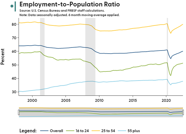
How do I remove lines from my chart?
To remove a particular line or other categories from a chart, click on its description in the legend below the chart. For instance, clicking on “16 to 24” removes the green line from the chart shown below.
Before:
After:
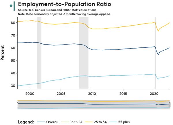
In the chart legend, “16 to 24” is now grayed out. To add the green line back, click “16 to 24” in the legend again. You may add or remove any number of lines from the final chart.
You can also display or remove the overall average by using the “Include Overall Line” button in the chart options.
How can I contact the creators of the Data Explorer if I have further questions?
Please send any questions to us at SFFed-Data-Explorer@sf.frb.org
How can I cite charts generated by the Data Explorer?
Please cite as: SF Fed Data Explorer, Federal Reserve Bank of San Francisco. Retrieved Month DD, YYYY; based on most recent (INSERT SURVEY NAME) conducted by (INSERT SURVEY ISSUER). https://www.frbsf.org/economic-research/sf-fed-data-explorer/
How do I download the chart I’ve created using the Data Explorer?
Once you’ve generated a chart, hover your cursor over it and a row of icons will appear near the top right corner of the chart area. To save an image (png) of your chart, click on the camera icon (circled below in red).

How far back do the data go?
The start date of each variable differs depending on the source.
Generally, for labor market indicators, “stock” variables begin in January 1976, “flow” variables begin in February 1994, and Median Usual Weekly Earnings are available as of January 1982. However, certain demographic options do not extend as far back as the base data. For example, the “Industry” and “Occupation” demographic options only go back to January 2000, and the geographic breakdown for weekly earnings starts in 2007.
All inflation variables and breakdowns are available starting January 1969.
Labor market data FAQs
How do I decide which Labor Market Data tab to use: Labor Market Status, Shifts in Labor Market Status (Flows), Weekly Earnings, or Job Openings and Labor Turnover?
The “Labor Market Status” tab reports a labor statistic by its level, either as an absolute number or as a percentage. These levels are referred to as “stock variables” in economic terminology, and they reflect a specific measurement at a point in time. An example of a stock variable is the unemployment rate, because it can be measured by looking at one point in time.
The “Shifts in Labor Market Status (Flows)” tab tracks how labor statistic data shift over periods of time. These shifts are referred to as “flow variables” in economic terminology, and they reflect how measurement values change over specific time periods, such as from one month to the next. An example of a flow variable is the “Unemployed-Employed Flow Rate,” which measures the percentage of people who shifted from being employed in one month to unemployed in the following month.
The “Weekly Earnings” tab tracks earnings by specific demographic groups, which is referred to as “earnings variables” in economic terminology. The earnings variable used in the Data Explorer is “Median Usual Weekly Earnings,” which provides a measure of workers’ earnings in a specific week.
The “Job Openings and Labor Turnover” tab contains data from the JOLTS survey, which asks business establishments about their job openings and turnover data on a monthly basis. The tab provides statistics on the number of job openings, employee hires, and employee separations (e.g., layoffs, quits, discharges) over time. For example, the job openings level variable shows the number of positions that were open on the last business day of the month.
How do I build my own time-series chart using the Data Explorer?
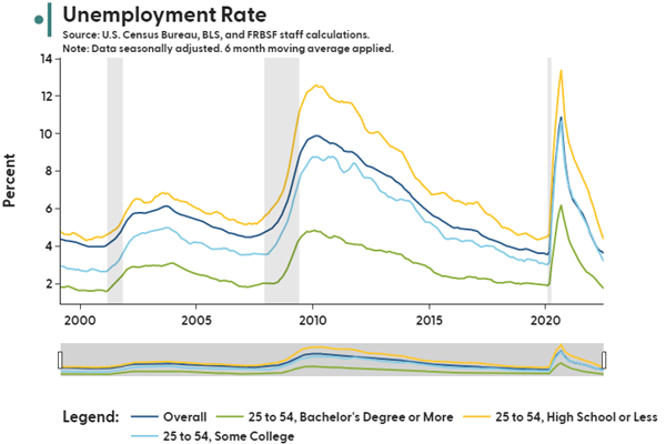
To generate your own time-series chart, begin by selecting one of the labor statistics (such as Unemployment Rate), then select “Build Your Own Chart” under Select View Mode. For a more detailed breakdown of the labor statistic, you may select an option (for example, Age Group) under the “Demographic Category.” If you are interested in dividing demographic groups according to more specific details (such as Unemployment Rate for different education groups among people ages 25 to 54), you can make a selection under “Refine,” then choose another demographic category in the drop-down menu. For instance, these selections:
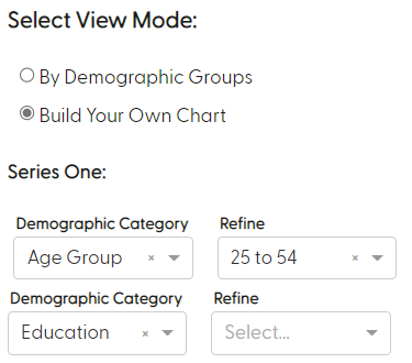
will produce Chart Code 11307101013o000021230000000000
If you are interested in comparing two time series within one chart, you may also select a different labor statistic under “Series Two.” Refining by demographic group works in the same way as in Series One.
Accordion Heading
How do I make my own pie chart using the Data Explorer?
To generate your own pie chart, begin by picking “Point-in-Time Breakdown” under Display Options. From there, choose the Year/Month you would like to learn more about. Next, select the Labor Statistic you are interested in, such as “Unemployed (#).” To see how the number of unemployed people differs according to a specific demographic (such as Education), select that option under “Demographic Breakdown.” If you are only interested in looking at that breakdown within a specific demographic group, you may specify your choice under “Refine by Demographic Group (Optional).” For example, for January 2018, to view the number(#) of Unemployed among people ages 16 to 24 according to their level of education, make these selections: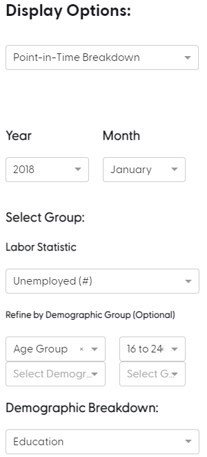
This will display the following pie chart, with Chart Code 124093600000000003011000000000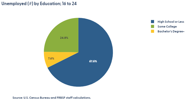
How do I create a map of the United States on the Data Explorer?
Maps are available to depict geographic breakdowns as a “Display Option” under the tabs for Labor Market Status, Weekly Earnings, and Job Openings and Labor Turnover.
What does it mean for data to be “seasonally adjusted”?
Seasonal adjustment attempts to remove seasonal fluctuations from the underlying data set. Shifts in non-seasonally adjusted data may be caused by conditions that are outside of the main factors you are intending to measure, such as holidays, weather patterns, and school schedules. By removing these impacts through seasonal adjustment, we can more directly examine, compare, and interpret the underlying trends.
How are moving averages calculated?
Moving averages are a mean average of data for a specific number of preceding months. For example, the three-month moving average is the average of the current month and the two months that precede it.
What does the Index to Base Date option do?
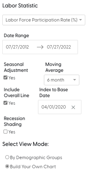
If you are examining charts that involve percentages, it may be useful to index each of your data series to a common value point on a specific date. Using this feature enables you to fix all the data points for that date to 100%, which makes it easier to make relative comparisons from a common point for each of the data series. This also allows you to see how much a variable has changed since the selected Base Date. For instance, if you are interested in growth in the Labor Force Participation Rate since April 2020, then using Build Your Own Chart with these selected options.
will produce Chart Code 115072010138096310000000000000
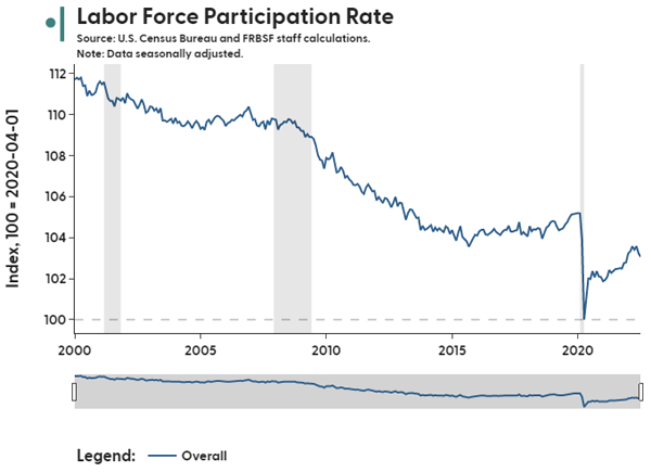
Using these parameters shows that the Labor Force Participation Rate in April 2022 was 3.4% higher than in April 2020.
What is the difference between Industry and Occupation in the Demographic Options?
We follow the Bureau of Labor Statistics (BLS) definitions, which are described as follows on their website: “The occupational classification reflects the type of job or work that the person does, while the industry classification reflects the business activity of their employer or company. The occupational and industry classifications are based on a person’s sole or primary job, unless otherwise specified. For the unemployed, the occupation and industry are based on the last job held.”
More information can be found at Historical comparability of occupation and industry data from the Current Population Survey (bls.gov).
What does the “Inflation Adjustment” option under the earnings tab do?
The Inflation Adjustment option allows you to decide whether you would like to look at nominal earnings (unadjusted) or real earnings (inflation adjusted). We use consumer price index (CPI) inflation to calculate real earnings, which are indexed with the value of 1982-1984 U.S. dollars equaling 100.
How are nominal earnings in Weekly Earnings adjusted to be real earnings?
The nominal series are adjusted using the Consumer Price Index (CPI), which is a price index of a basket of goods and services paid by urban consumers. The base of the index is 1982-1984, which makes all values relative to this period. The real earnings values are simply the nominal earnings divided by CPI for each month.
You can read more about CPI at Consumer Price Index for All Urban Consumers: All Items in U.S. City Average (CPIAUCSL) | FRED | St. Louis Fed (stlouisfed.org)
How do you define location of birth in the data?
We define “born in US” as anyone born in the United States, Puerto Rico, and other U.S. territories, independently of immigration status at birth. Persons “born outside the US” include those born to U.S. citizens abroad.
Why does the Time Series View have more up-to-date data than Geographic Breakdown?
Aggregated national-level data tend to be released before state-level data. Labor market status and earnings data for states are released roughly one month after national-level data. State-level data for JOLTS are released about two weeks after aggregate data.
How can I view the value of a state’s labor market statistic in the Geographic Breakdown display?
There are a few ways to see the values for a particular state when you are viewing a state map generated using Geographic Breakdown:
- You can hover your mouse over the state in the map to view a text box containing the state’s abbreviation and its value of the labor market statistic selected.
- You can use the “Refine Selection” dropdown to select up to five states. Each of these states will be highlighted on the map and its value will be displayed at the bottom of the map in a caption.
- You can press the “Download Chart Data” button at the bottom right of the map to get a csv file containing the date, state, variable, and value.
Why is the District of Columbia (i.e., Washington, DC) omitted from the Weekly Earnings Geographic breakdown?
The District of Columbia’s weekly earnings are omitted from the map due to its value skewing the color scale. The value is reported in the caption under the map.
What is demographic adjustment used for?
The demographic makeup of the population–for instance the proportion of people within different age groups–undergoes large changes over time, especially if considering periods that span several decades. The U.S. workforce is older today on average than it was 40 years ago. This can matter when comparing labor market statistics over time.
For example, workers in their prime working years, between ages 25 and 54, are significantly more likely to be employed than workers over the age of 55, many of whom have moved into retirement. An increase in the share of the population over the age of 55 will mechanically lower the overall employment-to-population ratio. As a result, economists often ask questions like, “What would the employment-to-population ratio have been without these demographic shifts?” Demographic adjustment can help answer these questions by holding certain demographic characteristics of the population constant and calculating labor market statistics in those “what if,” or counterfactual, scenarios.
Inflation data FAQs
What is inflation?
Inflation is the rate of increase in the prices of goods and services in an economy over a specified time period.
Stable and moderate levels of inflation are a natural part of a healthy expanding economy. Inflation that is too high, too low, or deflationary typically reflects imbalances in the economy that can cause longer-term economic instability and hardships for people, businesses, and communities.
For more information on inflation, see https://frbsf.org/topics/inflation/
How is inflation measured?
Inflation is measured by comparing the current prices of a set of goods and services to previous prices. Inflation measures mainly differ in how prices are calculated and in what set of goods and services are chosen to represent what American households typically spend money on.
The Federal Reserve measures progress on its mandate of promoting price stability using the personal consumption expenditures (PCE) price index by the Bureau of Economic Analysis. Other commonly used inflation measures in the United States are based on the consumer price index (CPI) and Producer Price Index (PPI) by the Bureau of Labor Statistics.
What is the difference between headline inflation, core inflation, and supercore inflation?
Headline inflation is the broadest measure of inflation and includes price changes of all goods and services.
Core inflation excludes the volatile food and energy categories from the headline measure.
Supercore inflation focuses on inflation in services categories that exclude energy services (e.g., utilities) and housing services (e.g., rents). Inflation in these categories has historically been the largest contributor to inflation in the United States.
What is annualized inflation?
You can view the 1-month, 3-month, and 12-month percent change in prices. To make changes over different time horizons comparable, we also provide an annualized version of the 1-month and 3-month changes.
Simply put, an annualized rate of change tells us what the 12-month percent change would be if the selected rate (e.g., 1-month change, 3-month change) continued for an entire year. Looking at annualized inflation rates at different horizons provides a gauge of the momentum of price changes in the economy.
How are inflation contributions calculated?
For a given measure of inflation (e.g., headline PCE inflation), contributions are calculated by adjusting the inflation rate for each component (e.g., demand-driven inflation) by the relative importance of this component to the overall index. The relative importance, or weight, of components is broadly based on how much consumers spend on these components as a share of overall consumer spending.
Suggested Citation
If you use the SF Fed Data Explorer in your own writings and publications, we ask that you cite this page, including the relevant primary data source.
For Labor Market data:
SF Fed Data Explorer, Federal Reserve Bank of San Francisco. Retrieved Month DD, YYYY; based on most recent Current Population Survey conducted by the U.S. Census Bureau for the Bureau of Labor Statistics. https://www.frbsf.org/research-and-insights/data-and-indicators/sf-fed-data-explorer/
For JOLTS data:
SF Fed Data Explorer, Federal Reserve Bank of San Francisco. Retrieved Month DD, YYYY; based on most recent Job Openings and Labor Turnover Survey collected by the Bureau of Labor Statistics. https://www.frbsf.org/research-and-insights/data-and-indicators/sf-fed-data-explorer/
For Inflation data:
SF Fed Data Explorer, Federal Reserve Bank of San Francisco. Retrieved Month DD, YYYY; based on calculations using most recent data from the Bureau of Economic Analysis. https://www.frbsf.org/research-and-insights/data-and-indicators/sf-fed-data-explorer/
The views expressed here do not necessarily reflect the views of the management of the Federal Reserve Bank of San Francisco or of the Board of Governors of the Federal Reserve System.